 "Demon-Xanth knows how to operate a street." (demon-xanth)
04/07/2017 at 10:09 • Filed to: None
 2
2
 6
6|
"Demon-Xanth knows how to operate a street." (demon-xanth)
04/07/2017 at 10:09 • Filed to: None | 2
| 6 |
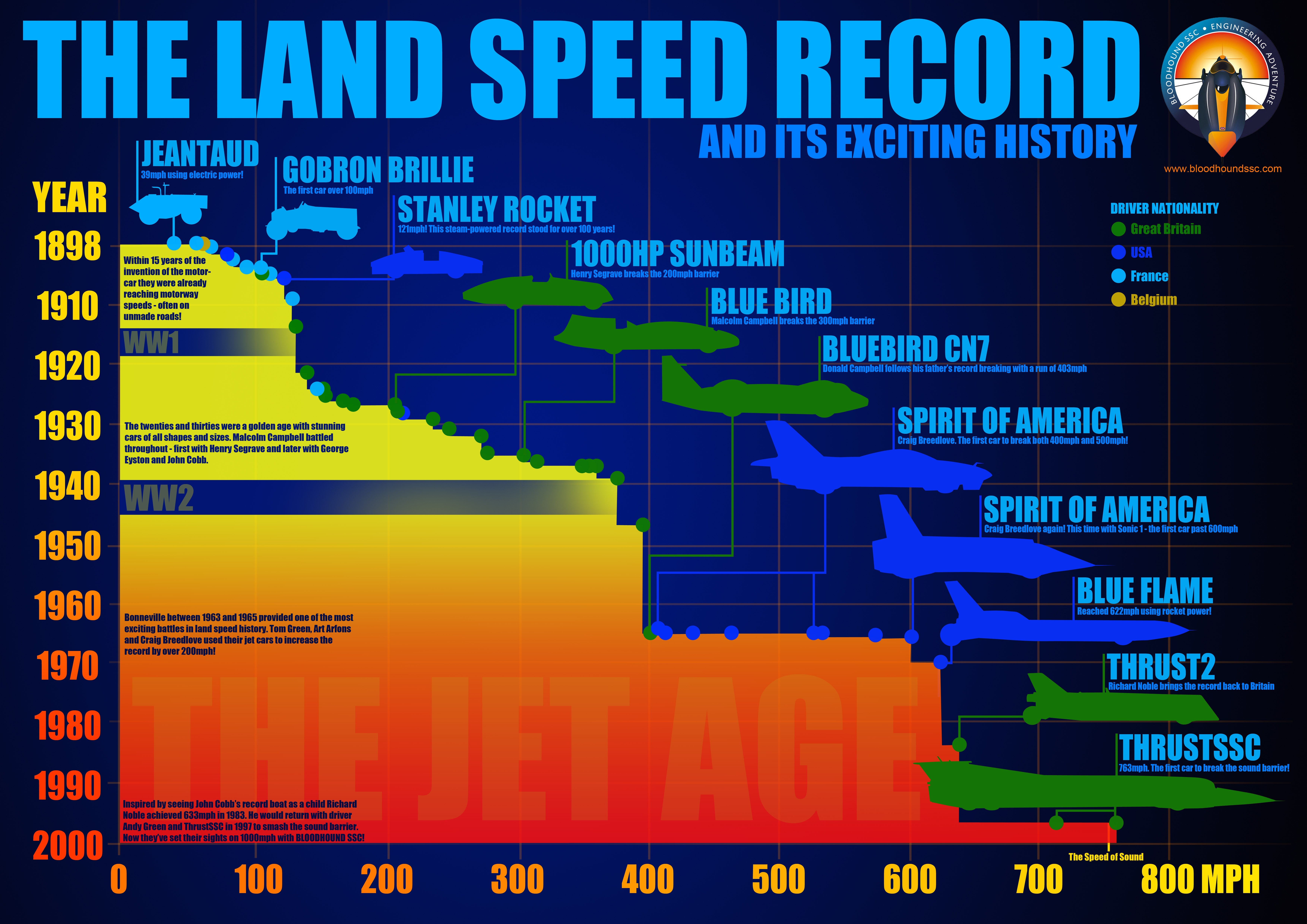
For some reason, I’ve long wanted to see a chart like this.
 TheRealBicycleBuck
> Demon-Xanth knows how to operate a street.
TheRealBicycleBuck
> Demon-Xanth knows how to operate a street.
04/07/2017 at 10:14 |
|
The two data points make the THRUSTSSC look like it has a set of janky wheels.
 BiTurbo228 - Dr Frankenstein of Spitfires
> TheRealBicycleBuck
BiTurbo228 - Dr Frankenstein of Spitfires
> TheRealBicycleBuck
04/07/2017 at 10:21 |
|
...you’re a genius!
Make it basically a low-flying jet plane, but stick a pair of casters on some longs springs underneath it so technically it’s still ‘on wheels’.
Unless of course they’ve got some killjoy ‘requirements’ for what constitutes a land-going vehicle :S
|
TheRealBicycleBuck
> BiTurbo228 - Dr Frankenstein of Spitfires
04/07/2017 at 10:24 |
|
Anyone who calls me a genius deserves a star!
 RamblinRover Luxury-Yacht
> Demon-Xanth knows how to operate a street.
RamblinRover Luxury-Yacht
> Demon-Xanth knows how to operate a street.
04/07/2017 at 10:25 |
|
I cannot endorse this chart, as it omits John Cobb completely in favor of narrative-building around the Campbells. The fuck, man.
 ZoomZoomSpeed3
> Demon-Xanth knows how to operate a street.
ZoomZoomSpeed3
> Demon-Xanth knows how to operate a street.
04/07/2017 at 10:35 |
|
Is it just me or should these axis be swapped? Years should be on X and speed on Y. Not only that but the years count up going towards zero. Interest level 10/10. Logical presentation 0/10
|
Demon-Xanth knows how to operate a street.
> ZoomZoomSpeed3
04/07/2017 at 10:38 |
|
Rotating it 90 degrees would make it rather...phallic.